
By Shane Chalke, Actuary and Mathematician
Hello all –
Here I am again hoping this will be my last report. Remember way, way back in June when COVID was shrinking rapidly in society, and life returning to normal. Then came Delta, mathematically behaving like a brand new disease. When I reported last in August, Delta was just beginning to slow down. Well, now it’s all but behind us. Here is the current picture of modeled known active cases:
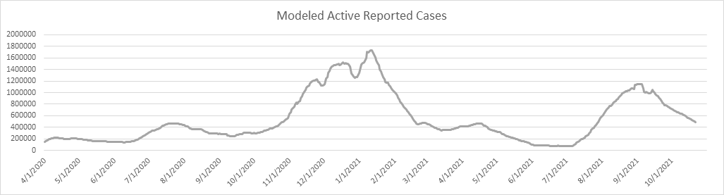
The Delta Wave is down 58% from the peak in early September. I think it’s interesting that each of the 4 waves have had a similar trajectory (shape and duration). By Thanksgiving I expect we’ll be back to where we’re in June of this year – COVID simmering along, but not really a factor in everyday life.
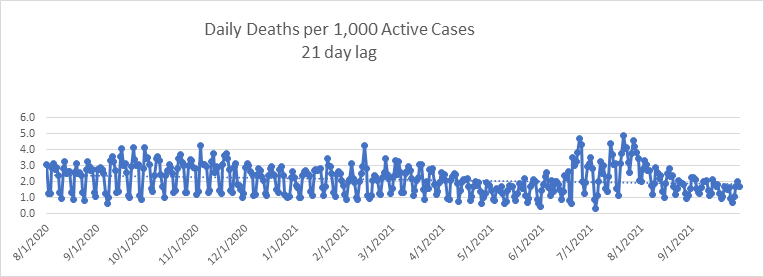
Now that we’re almost through with Delta, I can conclude that Delta was neither more nor less deadly than Alpha overall. Here is the trend for daily deaths per 1,000 known active cases with a 21 day lag. The daily data was more erratic in July (mostly for collection and reporting reasons – COVID data quality and timeliness deteriorated significantly since June), but since then it has stabilized, and not materially different from the previous twelve months. This surprises me, as the CDC only reports about 11,000 breakthrough deaths as of 10-18-21. With over 96% of the senior population having at least one dose, the Delta deaths must have skewed younger in age. I’m sure someone will study this in due time.
Let’s look at daily deaths in comparison to my daily death model. The model is still tracking reality fairly well. I’m showing peak daily deaths occurring about a month ago, and daily deaths falling below the 1,000 per day metric by early November. The IHME model (updated 10-20-2021) projects us crossing this line about November 10.

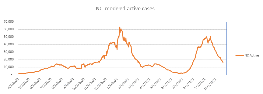
Let’s take a look at my home state, North Carolina. Modeled known active cases look like this. We peaked on September 17, and we are now a full 68% down from the high point. I do trust the NC data more than the CDC data. NC doesn’t revise the historical data much – the CDC data is quite unstable, with constant revision. In any event, if NC stays on trend, we’ll have very little COVID by mid-November.
And here are NC daily deaths. Again, the pattern follows the national statistics.

So what puzzles me is why all the waves look similar? Remember that it all started with the Northeast Wave (Wave 1), then the Sunbelt Wave (Wave 2), then the Midwest and Western Wave (Wave 3), and finally the Delta Wave (Wave 4). Why does every wave follow the same 8-10 week pattern of rapid rise and then rapid burnout? I would have thought with about 80% of all U.S. adults have at least one shot (over 96% of seniors) that somehow this would look different. But no. In fact, our largest wave (Wave 3) began it’s precipitous decline well before vaccines were common. I’m not at all implying that vaccines are not effective – I’m simply saying that it doesn’t seem to be the vaccines that wiped out Alpha – it burnt itself out before the wide propagation of vaccines. Did vaccines have an effect on Delta? Yes, I think so, as the magnitude of Delta was about 2/3 that of Wave 3. On the other hand, Delta did act like a new disease – the Delta Wave was far larger than Wave 1 or Wave 2. There is a lot of fertile ground for research here.
In any event, I’m hoping that I don’t need to report again. Yet if something unpredictable happens, I’ll be back.
Cheers.
–Shane Chalke, FSA
Shane Chalke Interviews
https://www.youtube.com/watch?v=RBor5ZqiRag
COVID, By the Numbers (virginiainstitute.org)
Website
Groom Ventures has agreed to host a website that will archive my daily reports, and supplement with other commentary. John Groom worked at one of my companies back in the day, and is an excellent writer. The website is: www.howmuchrisk.com For those of you that post my daily report on Facebook, let me suggest you link to this site, as the direct Facebook posts don’t seem to copy the graphs.
The Modeling
I’ve added this section, which I’ll leave on the report permanently. Note that I’ve been (and continue) to report on and model “Reported Cases”. These reports come from the various states and I retrieve my data from www.infection2020.com and www.covidtracking.com. I regularly check their numbers against several other reporting sources (including the CDC) to make sure the numbers track well. To be reported as a case, the subject must have been tested at the state level, with a positive finding. It is not necessary that the case be validated by the CDC, as was the case in early March. Some jurisdictions are now reporting likely cases that have not tested positive. As of April 17th, states report likely, presumed, and confirmed cases all as confirmed.
My model of cumulative reported cases was developed by fitting a Logistic functional form to the reported data. I calculate new parameters for the model from time to time. I translate Cumulative Cases to Active Cases by assuming the time from case reporting to case recovery is 7 days. I hypothesize this by assuming a 13 day disease cycle, but 3 days from symptoms to sample collection, 3 days from sample collection to test reporting, and another 7 days to case resolution on average. Technically, these are “estimated reported and still active cases”, but I’ll often refer to them in shorthand as simply “active cases” or “active reported cases”.
Reported Cases does not encompass everyone who has contracted the disease in U.S. society. Some do not seek testing, some in the early days couldn’t get a test (not so true anymore), and some contracted the disease, but were asymptomatic. We cannot know, and may never know, how many citizens actually have the infection. That said, so long as the protocol for testing and reporting remains stable, the data should be stable and represent the course of the disease. I have not modeled mortality at this time, as I believe others are doing this well.
Who Am I?
This list is big enough now that many of you don’t know me. I don’t much like doing this, but you’ve asked lots of questions about how my background qualifies me to do this work. Although I retired 15 years ago to play jazz full time (I play about 180 shows a year – at least until this), my business career was as an actuary, which is a mathematician that specializes in insurance and mortality. For the majority of my career I created mathematical modeling software and sold it to insurance companies, banks, actuarial firms, and investment banks.
1983: Won Society of Actuaries Triennial Prize for the best academic paper in a refereed journal over 3 year period
1986: Won Society of Actuaries Annual Prize for the best academic paper published that year
1987: Elected President of the Product Development Practice Section of the Society of Actuaries
1990: Elected to the Board of the Society of Actuaries as the youngest board member in its history
1993: Elected Vice President of the Society of Actuaries
1994: Editor, North American Actuarial Journal
1997: Taught graduate level finance theory at George Mason University
2005 – 2006: Guest Lecturer, Cornell University, Economics
2006: Referee, North American Actuarial Journal
Mortality Discussion from April 28, 2020
Now, a thought or two about mortality. On April 23rd NY reported completing a somewhat random test of 3,000 New Yorkers for COVID antibodies. https://www.newsweek.com/test-shows-21-percent-new-york-city-residents-who-gave-samples-have-coronavirus-antibodies-1499878 Tests were done earlier that week for randomly selected individuals in grocery stores and shopping centers. Of the 3,000 tested, 15.9% were shown to have had the COVID infection. Since that time, New York has revised that number up to 16.9%. This is incredibly useful information, and provides us with a first meaningful clue about mortality. I first did a rough calculation of NY mortality rate by extrapolating the random test results to the NY population, then aligned deaths with the exposure period. From this I calculate a mortality rate of 0.53%. This is not unexpected, but it is much more interesting when broken down by age. When I look at cohorts of age 60 and over, and 59 and younger, and go through the same calculations, I get an estimate of mortality rate for these two age groups of:
Age Mortality Rate
0-59 0.09%
60+ 2.50%
Now there are lots of issues with my calculations. First, although the sample may have been random, there was some self-selection, as the sample pool was composed of those willing to leave their homes, which I bet skewed younger and less risk-averse. I also do not have a demographic breakdown of the sample. The only thing I know is that no one over age 75 was sampled. This is a major issue, as over ½ of all deaths in NY are over age 75. This leads me to believe that COVID prevalence is actually lower among the 60+ cohort, and higher among the 59- cohort. As a result, I believe that the mortality rate for the elderly is higher than that calculated above, and the mortality rate for those under 60 is lower than that calculated above. By the way, I would have preferred to use an age 65 cutoff, but unfortunately the NY Department of Health only reports deaths in deciles. Ideally, if I had the data, I could study mortality in 2 cohorts – those over 65 or with certain co-morbidities, and a second group of under 65 without certain co-morbidities. I believe you’d find a mortality rate in the first group well over the 2.50%, and the mortality rate in the second group much closer to nil.
So as we recover as a society, the methodology seems settled that we’ll unlock one geographic area at a time. But we have 2 easily identifiable populations, once with relatively high risk, and one with a tiny fraction of the risk. It occurs to me that we could more safely unlock by doing it demographically, rather than geographically. We could extend shelter in place rules for seniors and those with definable risk factors, and eliminate them for the under 65 and healthy population. It would also be fairly easy to define perhaps one concentric circle around the vulnerable by maintaining shelter in place rules for certain caregivers and health care workers. So that’s my message for today: Unlock Demographically, Not Geographically.
I’ve already received quite a few questions about the mortality rates I quoted this morning, which were:
Age COVID Mortality Rate
0-59 0.09%
60+ 2.50%
The common question is “what does it mean?”. These mortality rates represent the probability of death for those unlucky enough to be infected. The general population mortality rate (the probability of someone generally dying from COVID) is much, much lower. So these rates can be interpreted as “a person contracting COVID and age 59 and under has a 0.0009 chance of dying from the disease. Put another way, for every 1,111 people under age 60 contracting COVID, 1 would be expected to die. For those over 60, the number is about 1 out of 40, a remarkable difference.
The second question I received in numbers was “is 0.09% low or high – relate it to something”. OK, so in the general population in the U.S., the average 50 year old has a 0.5% chance of dying within a year (sorry for that news). This probability is roughly 5 ½ times higher than the probability of dying IF YOU CATCH COVID.
For the average 75 year old in the U.S., the probability of dying within one year is 3.6%. This is about 1 ½ times higher than the probability of dying IF YOU CATCH COVID.
How can this all make sense? Well, it seems Actuaries dwell on this the most, but each year about 3,000,000 people die of all causes in the U.S. When all is said and done, it looks like COVID deaths in the U.S. this season will make up about 2-3% of that number.
I’m going to pin this and this mornings mortality discussion to the bottom of the reports, since many new people join this list every day.
Model Discussion From May 5, 2020
So there are numerous headlines about increased COVID propagation this month. It is primarily coming from Epidemiologic models with many assumptions. My modeling work was purely mathematical – fitting non-linear functions (in my case Logistic functions) to time series data. Disease models use many assumptions about transmission rates, mobility, transition probabilities through various states of disease, etc.. The IHME model was more of a pure mathematical model until this latest revision, where they moved to a hybrid model. I believe they painted themselves into a corner when they declared some weeks ago that no relaxation of restrictions was safe until a state had less than 1 COVID case per million of population. No state has (or will likely) meet that criteria. We likely don’t meet that criteria with flu even this late in the season. So with states opening up now, they really had to project a worsening of results. However, the problem with the assumption driven models is that they have very wide confidence intervals – a few tweaks in assumptions and they produce very different results. What we see happening now is that some modelers are ASSUMING that relaxing restrictions must have a significant negative effect. I’m not so sure. The disease was already slowing down in late March before most of the lockdowns could have any effect. The lockdowns didn’t change much, and I expect releasing them won’t change much either. Why? Simply because the lockdowns are not the most significant motivator of human behavior. People started self-preservation behavior long before they were told to, and they will adapt to the great opening by finding new and continuing ways to be cautious. In any event, we can speculate about growth in COVID over the month of May, but there is no evidence of it yet. The data are still in decline.
Discussion of lockdown effectiveness from May 27, 2020
Over the past 2 days I’ve completed my first (of several, I hope) investigations into the effectiveness of lockdowns. Before I get into the mechanics and empirical results, here are my conclusions so far:
- Does social distancing (being cautious) slow the progress of COVID? Probably.
- Do lockdowns slow the progress of COVID? I don’t think so.
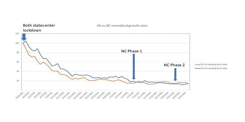
Now, on to why I come to these early conclusions. With the patchwork of states in various phases of social and business restriction, it is quite difficult to isolate experiments on which to base conclusions. The closest I can come to this is comparing Virginia to North Carolina. Both states have similar populations, climate, geography, nearly the same population density, and have had similar COVID growth rates. More importantly, both states imposed stay at home orders on the same day, March 30th. This makes for a reasonable set of observations on which to do some analysis.
From there, the paths differ. Although Virginia entered a modified Phase 1 on May 15th, it only applied to rural areas, and didn’t affect the majority of the population, which as of today is still under the stay at home order.
NC, on the other hand, moved into Phase 1 on May 8th, and on to Phase 2 on May 22nd.
To make a reasonable comparison, I looked at COVID daily growth rates in reported cases from March 30 to May 26. Since both states have erratic daily data, I calculated the five-day moving average of daily growth rates for each state, and then normalized those growth rates on March 30th to a radix of 100. From this, I can show a graphical representation of the disease progression by state. It looks like this. Do you see any meaningful differences? I don’t either. Of course, it’s too early to notice any effect of NC Phase 2, but I’ll run this analysis again in a week to see what we see…
So why don’t we see the continued stay at home order in VA having an effect? From this point, I can only theorize. I believe it’s because societal behavior is not dependent on stay at home orders. People will be cautious as they see fit, regardless of executive orders. It is possible to estimate social mobility from credit card and mobile phone activity. This next picture is from the IHME site, showing social distancing as of yesterday.
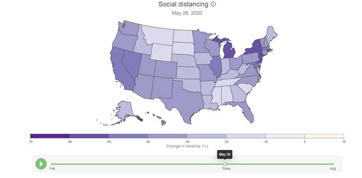
Notice anything interesting? Virginia and North Carolina are in the same band of social mobility, even though NC is well into Phase 2 and the majority of Virginia is still subject to stay at home orders. I’m going to continue to study this, but my early conclusion is that stay at home orders don’t result in people staying at home any more than if there were no stay at home order. More to come…
Theory on low mortality rates from July 16, 2020
We continue to see deaths growing at a fraction of the case growth. You’ll read a lot about deaths being a lagging indicator, and although true, the propagation of the disease is skewing younger, so the fatalities are not increasing with the case count. We are now seeing a mild upward trend in daily deaths, but small in proportion to the increased case count. (In fact, the latest revision of the IHME model projects that daily deaths do not go above 1,000 again.) I believe this is because:
- We’re testing people who are less ill as the testing protocol widens, so the survival rate is higher
- We are getting better at keeping those that are hospitalized alive
- The scope of testing is still expanding generally, so the increase in cases is not representative of a like increase in prevalence
- Younger people are a larger percentage of those newly infected, and their mortality rate is close to nil, so very few show up in the fatality stats
- Double counting of cases is increasing, including antigen and antibody tests, as well as PCR tests – we know that AZ, CA, TX, and SC double count cases (per the COVID Tracking Project)
Discussion on daily death count as a lagging indicator from July 23, 2020
As I’ve been predicting, we’re seeing a gradual rise in the daily death count. The rise in deaths is small in proportion to the rise in cases. We’ve seen the new daily death count go from about 600 to 1,000, while the daily new case count rose from about 20,000 to 70,000. Many on the news have talked about the lengthy time between case growth and death count, so I examined a few states that are well past peak to see how that worked out.
New York hit peak active cases on April 10th, the same day they hit peak daily deaths. Massachusetts peaked with active cases on April 25th, and peak daily deaths happened on day later on April 26th. Pennsylvania had the longest lag time – peak cases on April 11, and peak daily deaths on May 1, almost 3 weeks later. I’m thinking that IF we are cresting with active cases now, then we’ll see peak daily deaths in 10-15 days, somewhere between August 3 and August 8. The latest IHME model is projecting a new crest in daily deaths on August 13th, at just under 1,000, and far less than the peak on April 16, where we were seeing over 2,300 deaths per day. There are a number of reasons for this (see discussion at the very bottom of this report). Primary, though, is societal behavior. Seniors and those with health problems are exhibiting social distancing, quarantine, and other precautionary measures, while the disease spreads among a younger demographic, with a much lower mortality rate. We know that the mortality rate for pre-retirees without serious pre-existing conditions is very near zero.
Discussion of population ceiling from August 2, 2020
I’ve talked a lot over the past weeks about how COVID known active cases tend to peak in the range of 0.25% to 0.50% of the population in a given area, then decline. For the longest time it has puzzled me. However, I’ve been seeing more and more theories about full or partial immunity in a large swath of the population. Although I know little about medicine, this is quite congruent with the data, so I tend to believe it has some validity. Here is an article published today on CNN by Dr. Sanjay Gupta, postulating that as much as 50% of the population carries some level of built in resistance to COVID: https://www.cnn.com/2020/08/02/health/gupta-coronavirus-t-cell-cross-reactivity-immunity-wellness/index.html
This may be the missing piece of the puzzle. I’m seeing a ceiling in known active cases of, let’s say 1/3 of one percent. Now bear with me for a little arithmetic — When a location reaches this threshold, roughly 5 times the active case count has confirmed positive, so that means something over 1.5% of the population has been confirmed to have had COVID. However, we know that the actual prevalence of the disease is a large multiple of known cases. There is quite a range here based on the various antibody studies, but the average consensus seems to be about 10x. Assuming that, when a locality reaches the ceiling, perhaps 15% of the population has had COVID in total. If we add this 15% to the 50% of the population that has some level of innate immunity, we have 65%, which is right in the range of herd immunity.
It’s puzzled me for quite some time why so few people contract this disease. Even with a prevalence multiplier of 10x, we’re just now (after 5 months) seeing numbers of cases that match the flu each year. If it’s so contagious (I also remain skeptical about that), and it doesn’t attenuate in the summer, why so few cases? I know there are a lot of assumptions in my arithmetic exercise above, but it’s the only theory that matches the data so far, so I’m inclined to believe it until we have a better explanation.
Discussion of Sweden from August 16, 2020
I couldn’t find a single source modeling active cases in Sweden, so I ran Johns Hopkins’ data through my model, and see this:

This surprised me for a number of reasons. First, Sweden peaked later than I would have guessed, on June 29th. Also, the peak is relatively low, at 0.085% of the population. They didn’t have nearly the reported COVID numbers I would have expected. Here is where Sweden stacks up against the 15 states that I follow:
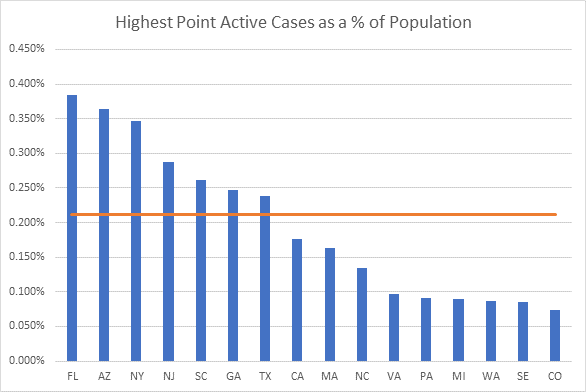
This is stunning to me. Sweden (SE) is the next to lowest on my list. Why so low? We find a clue in an antibody study from mid-May in Stockholm. 7.3% of those tested had COVID antibodies. At that time, there were 29,192 documented cases in Sweden, or 0.29% of the population. This implies that the total prevalence was something like 25 times larger than the documented cases. (Yes, I’m extrapolating Stockholm to the rest of Sweden, but I’m just trying to ballpark things here.) Sweden now has had 84,279 documented cases, so applying the 25x multiplier, we get a total of 2.1 million cases, or about 21% of the population. (Yes, I made another assumption – that the prevalence to known case ratio is static). OK, keep that 21% in mind for a moment.
I’ve been writing a lot recently about the latent immunity of a large swath of the population. The studies pointing to this are growing. The theory is that that T-Cell response is cross-reactive with other Corona viruses, including the common cold. I cited studies last week. Here is the important one:
https://science.sciencemag.org/content/early/2020/08/04/science.abd3871
A recent paper from Oxford University takes into account the variability in susceptibility to the disease, and calculated a Herd Immunity Threshold of between 10 and 20%!
https://www.medrxiv.org/content/10.1101/2020.07.23.20160762v1.full.pdf
Here is an important quote from the paper: “These findings have profound consequences for the governance of the current pandemic given that some populations may be close to achieving herd immunity despite being under more or less strict social distancing measures.” This is simply stunning.
What does this all mean? Simply put, if we have a significant percentage of the population with some resistance to the disease, the herd immunity threshold is much lower than the long thought 60-70%. Another way of saying this is that with a disease like this, with some level of societal resistance, we don’t need nearly as many cases as previously assumed to reach the turning point. This is what I’ve been seeing in the data, with a ceiling on known active cases (which are a fraction of actual prevalence) at a very low 1/3 of one percent of the population. I’m guessing this is where Sweden is now, having reached the Herd Immunity Threshold.
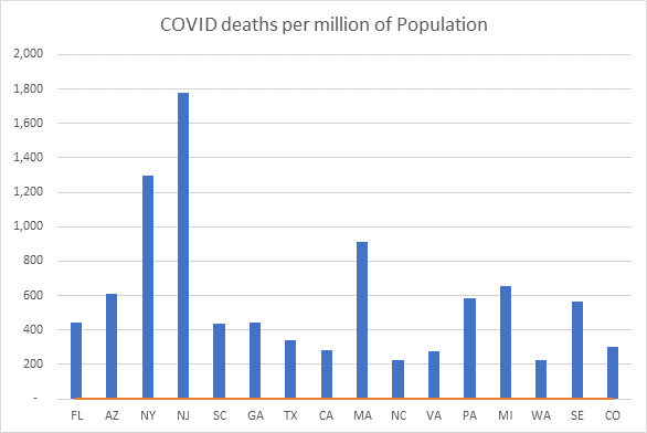
Let’s look at Sweden’s mortality results. As of today, Sweden has had 5,783 deaths. They are now down to low single digit deaths per day, so this number is incrementing very slowly. If we compare deaths to date with the 15 states I track we see that Sweden comes near the middle of the pack. AZ, NY, NJ, MA, PA, and MI fared worse, and the rest of the states have a better result so far. However, some of these states are still reporting significant daily death counts, while Sweden is not, so I’m thinking that Sweden’s ranking on this graph will even improve over time.
So what do we make of all this? It’s tempting to jump to the conclusion that social restrictions are not effective, but I’m not there yet. I do believe that social distancing, school, and business closures must have an effect, but I bet it’s not nearly as effective as we assume. It’s looking more and more like we can slow down the approach to herd immunity, but we can’t avoid it, hence the set of states that peaked early and low, but are increasing again. It will take years of research and statistical analysis to sort this out, but I think now the burden of proof has shifted to those favoring restrictions.
Discussion of COVID timeline from December 9, 2020
So now that we’re on the cusp of a vaccine for COVID, this is the question everyone is asking. As you know if you’ve been reading my reports since March, I primarily report on known active cases, which I derive by modeling new cases and recovery rates. I do speculate from time to time on the “why” as well as the “what” from a mathematical viewpoint. A common theme of these reports is the observation that most geographical areas seem to hit a prevalence ceiling, where known active cases reach a limit (usually between 1/3 and ½ of one percent of the population, then recede. We’ve seen this in wave 1 (the Northeastern states), and again in wave 2 (the sunbelt states), and during the current wave 3 with a number of the midwestern and western states. I have hypothesized that this behavior occurs because a significant percentage of the population (varies by area) has some resistance to the disease. There have been a number of articles to back this up, finding an innate resistance to COVID from T-Cell cross-reactivity. In other words, if you’ve had other corona viruses (most notably the common cold), you may have some level of COVID resistance. Researchers vary on the percentage of people with innate resistance, but numbers range from 20 to 50% of the population (see my discussion from August 2nd near the end of this report).
If this is true (I think it is, as it explains the ceiling phenomenon), then herd immunity may be closer than many think. Let’s look at some numbers. There are about 330 million people in the United States. Sometime today, we crossed 15 million known cases domestically. Way back in the spring and early summer, antibody studies revealed a total prevalence to reported ratio of about 10 to 1. I can’t believe that this ratio is as high today with testing running nearly 2 million per day, so I’m going to ballpark the current number at ½ that, or 5 to 1. With that assumption, roughly 75 million Americans have or have had COVID. If we add to that the number of people with innate resistance (I’ll use the mid-range number of 35%) that’s another 116 million people, for a total of 191 million people with some level of immunity. That is about 58% of the population. The current run rate of new cases is about 1.4 million a week. If this continues for the next month (It could attenuate somewhat after the Thanksgiving bump), that’s another 5.6 million cases, which when hit with the prevalence multiplier is another 28 million people with immunity. So with that, we’d expect a total of about 219 million people with some level of resistance to the disease by early January. That brings us to 66% of the population, very close to herd immunity, if not already there.
Now, on to the vaccines. A lot will depend on the public policy in the various states as to who receives vaccinations first. If you vaccinate congregate living residents first, I think you’ll have the greatest impact on deaths, but not the greatest impact on cases, since this demographic is a high proportion of deaths, but a much smaller proportion of new cases. If you wanted to decrease the new case count the fastest, vaccinating young people would be most effective. In any event, let’s assume that vaccinations are uniformly distributed amongst those that already have COVID resistance and those that do not. It makes sense to me that those that have had COVID would not be vaccinated until the tail end, but I have no idea whether that will happen. So for every 100 people vaccinated, 66 will already have some immunity, and 34 will be those susceptible to COVID. With that in mind, it would only take 87 million vaccinated Americans to reach 75% resistance, which, depending on who you read, is in the ballpark of herd immunity. Now I’ve made a lot of assumptions here, and this is admittedly speculative, but in the absence of better data, I think this is a reasonable analysis.
In this nascent stage, the rollout numbers for vaccinations are all over the map, but it looks like we could reach herd immunity by the end of February. I’ll continue to report during this phase, as it will be interesting to see when meaningful decline takes place.
2021 Predictions from December 31, 2020
Happy last day of the year – I’ll do the full rundown on the numbers below, but first here are my thoughts on what we’ll see next year. Let’s start with what we know now that we didn’t last March – I’d say there are two major revelations.
COVID is far less deadly than most people thought last spring. I did my first mortality calculations in April, where I calculated a blended mortality rate of about 0.5%, but I was nearly alone in this thinking. By summer, nearly everyone agreed with my numbers, and now it’s common knowledge that the overall mortality rate is a bit below 0.5%, and the mortality rate for those under age 60 is flu-like.
COVID is far more prevalent than anyone thought at the beginning. Because testing throughout the spring was focused on those displaying symptoms, a vast number of mild or asymptomatic cases were missed. Studies from antibody testing, autopsies, and non-related blood tests showed a prevalence to reported ratio of anywhere from 10 to 50. I do believe that the prevalence to reported ratio has steadily fallen, and I estimate it’s in the 3x range now (based on triangulating from mortality data).
This early view, that of a deadly disease with few cases, led to containment strategies – tracing and lockdowns. But we now know we’ve been battling a far more widespread, but far less deadly disease. Containment strategies have not been effective. In fact, my working theory for months now is that the disease reaches a saturation point in any given population, and then declines, irrespective of containment measures. Early on I estimated this saturation point was known active cases equal to 1/3 to ½ of one percent of the population, but now I think it’s more like ½ to 2/3 of one percent, primarily as a result of the falling prevalence to reported ratio. I believe the reason for the population ceiling is that’s when the disease begins to become resource constrained (herd immunity). For more on this, see my discussion below from August 2, 2020.
So what does this mean for 2020? Of course, the biggest news is the vaccine rollout. My math tells me that we will need far less vaccine deployment to contain COVID than most of the experts are claiming. I think somewhere less than 100 million inoculated will do it. For more, see my December 9th discussion below. However, any additional inoculated people slows down COVID transmission. To see real declines, we don’t have to reach herd immunity – we just need the transmission rate (Rt) below 1.0. Every person who gains immunity, either through contracting COVID, or through inoculation, slows down the transmission rate. As a result, I predict that we’ll see COVID in rapid decline in 2 months’ time, by the end of February, and life will more or less return to normal by spring 2021. After springtime, we’ll still see breakouts in certain communities based on vaccine acceptance, but it will be even more geographically localized than it is now, and these clusters will burn out quickly.
Discussion of vaccine effect from February 1, 2021
As predicted, COVID is in rapid decline nearly everywhere. Since the national peak on January 11, we have declined by just under 700,000 active cases, for a drop of over 40%. Most of this decline is the natural course of the disease, but from this point on vaccinations will dominate the decline. I’m still modeling that we need less than 100 million vaccinated to reach herd immunity, and far less than that to influence the numbers. As of today, 26 million people are reported to have had one or more doses in the United States – with reporting lags, the true number is likely around 30 million. Many experts say we need 75% or more of the population vaccinated to reach herd immunity, or about 250 million.
Why do I think the number is so much less? Let’s start with how many people have had COVID. The official number reported as of yesterday is 25.8 million, but we know that reported cases are a fraction of those that have actually been infected. Serum studies back in the spring and summer suggest that anywhere from 10 to 50 times the reported number actually were infected. I believe that this multiple is much lower now with more ubiquitous testing. In fact, based on my mortality calculations in the spring, I triangulate that the current ratio is about 3.6. In other words, 25.8 million people have tested positive for COVID since the beginning, but more like 93 million have actually been infected. Since the ratio was certainly higher in the beginning, I’ll round up and call it an even 100 million – it could be more.
In addition to this, I believe that a substantial portion of the population has innate resistance to the disease. Those that have studied this estimate that somewhere between 20 and 50% of the population has some level of immunity due to T-Cell cross-reactivity with other viruses (for more on this read here: https://www.cnn.com/2020/08/02/health/gupta-coronavirus-t-cell-cross-reactivity-immunity-wellness/index.html) If we assume the mid-point, that would suggest that 35% of the U.S. population has some level of built-in resistance to COVID. That would be another 116 million people.
I picture it like this:
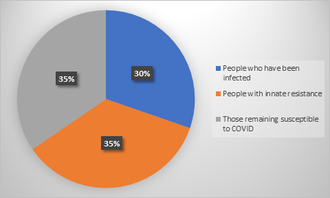
The grey area represents those that are still susceptible to COVID, about 35% of the population. I’m assuming that the balance (65% of the population) now have some level of immunity, not including any of the recently vaccinated population. To get this number up to 75% — the range of herd immunity – we require that 33 million of the susceptible group be vaccinated. Of course, vaccines are not given only to those susceptible, but more evenly distributed across the 3 groups. Assuming an even distribution of vaccines, we require about 94 million vaccinated to get the job done. It would be less if we put those that had COVID later in the vaccination process, but I don’t think anyone is talking about that. In any event, it won’t take nearly as many vaccines as you’ve heard to make a serious dent in the COVID numbers.
Of course, these estimates are rough – we don’t have anything better to go on, but I think I’m in the ballpark. Also realize that I’m making three major assumptions here:
- That those that have had COVID are substantially immune in the short term
- That the vaccines are effective in preventing COVID
- That a substantial portion of the population carries innate resistance to COVID
As far as the first assumption, I realize that there are reports of people contracting COVID more than once, but so far these are anecdotal reports and not statistically significant. The second assumption does not seem to be controversial, and the third I have written about over the past 6 months regularly. I continue to believe it based on the testing evidence and how well it explains the math. In any event, we’ll know soon enough…

